Serific
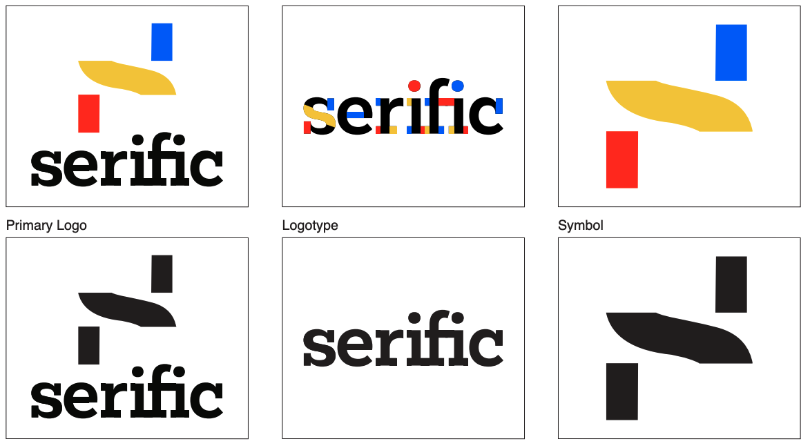
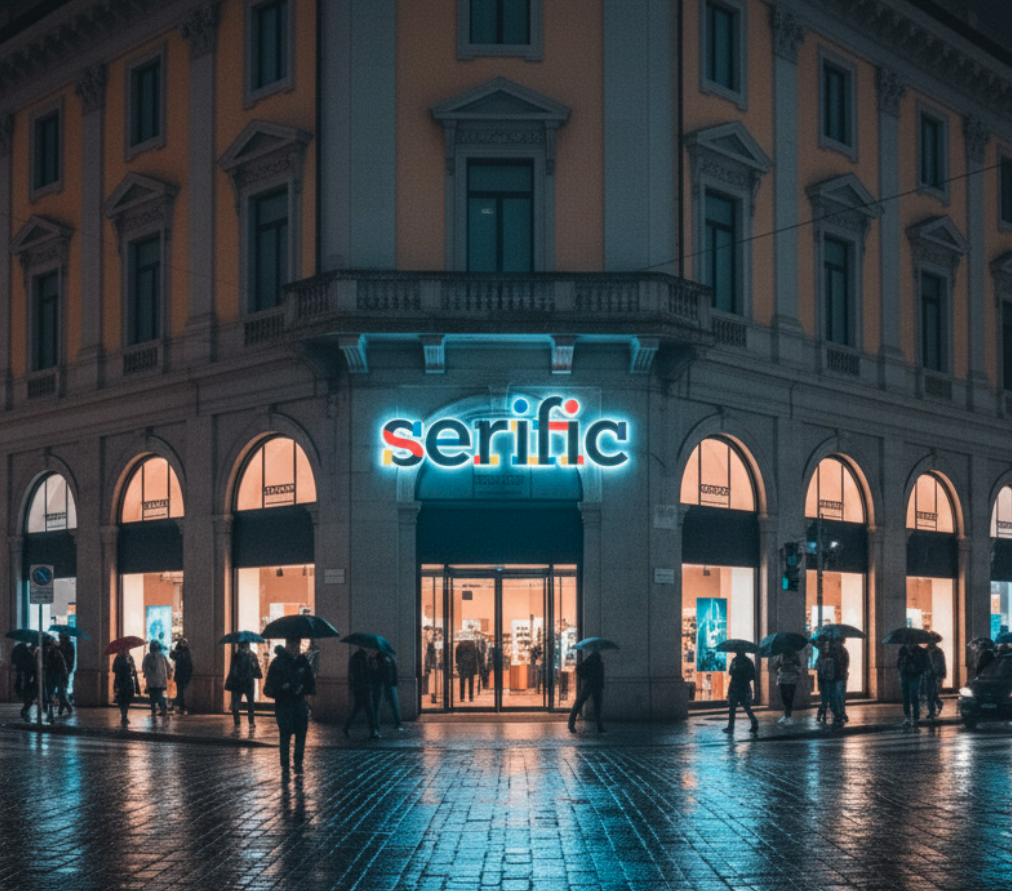
Serific is an international typographical product design store. Although founded in Pittsburgh, it has stores in Shibuya, Milan, New York City, London, Miami, LA, etc. Unlike other design stores, Serific focuses on the unique two-dimensional forms of typography and translates them into beautiful three-dimensional products. When picking a typeface, I knew I wanted to pick a serif one because of the company name. I landed on a sleek geometric slab serif typeface named Mokoko. I was attracted to this typeface because I wanted the clean and playful aesthetic to reflect the company. I chose to highlight the anatomy of the text because type anatomy is what makes a typeface.
Brand Personality
Here are some descriptions I wanted to convey through this brand
Approachable
Clean
Friendly
Informative
Elegant
Fresh
Bubbly
Sleek
Type Study
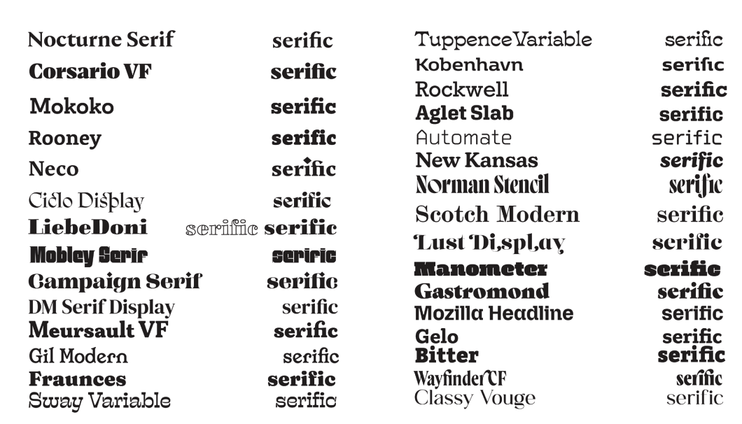
From the names I came up with, I chose to go with “serific”. With that being the name, I knew I wanted to choose a serif typeface. Because this is a type store, I wanted the logo to be a logotype.
Final
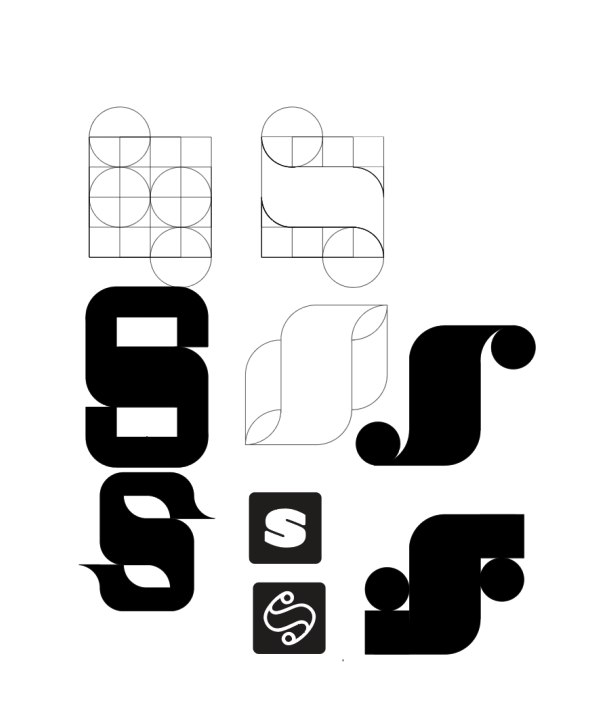
Symbol Ideation
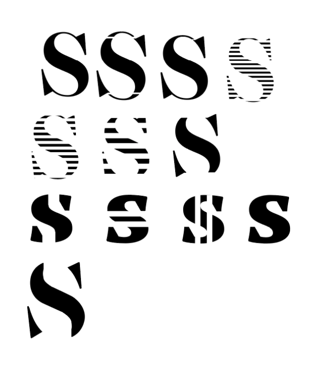
Although I wanted a logotype for my main logo, I still needed a symbol/Icon that can be used at smaller scales.
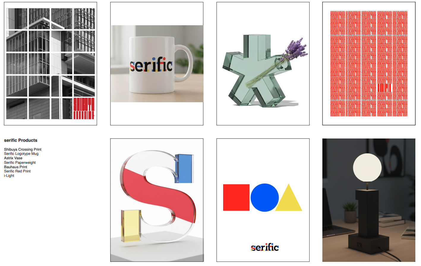
Products
Possible Names
Serific
Ascend
Typora
Intydec
Keimeno
Type Coach
Typevice
Taip (type)
Sketches
Logotype Ideation
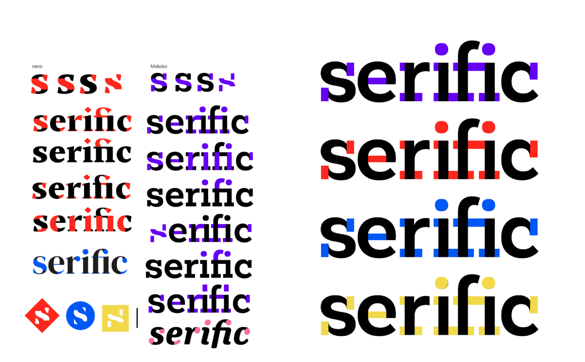
Once I narrowed my typeface options for the logotype, I decided to highlight the type anatomy since this is a typography store.