Type Design Inspired by Portland, ME
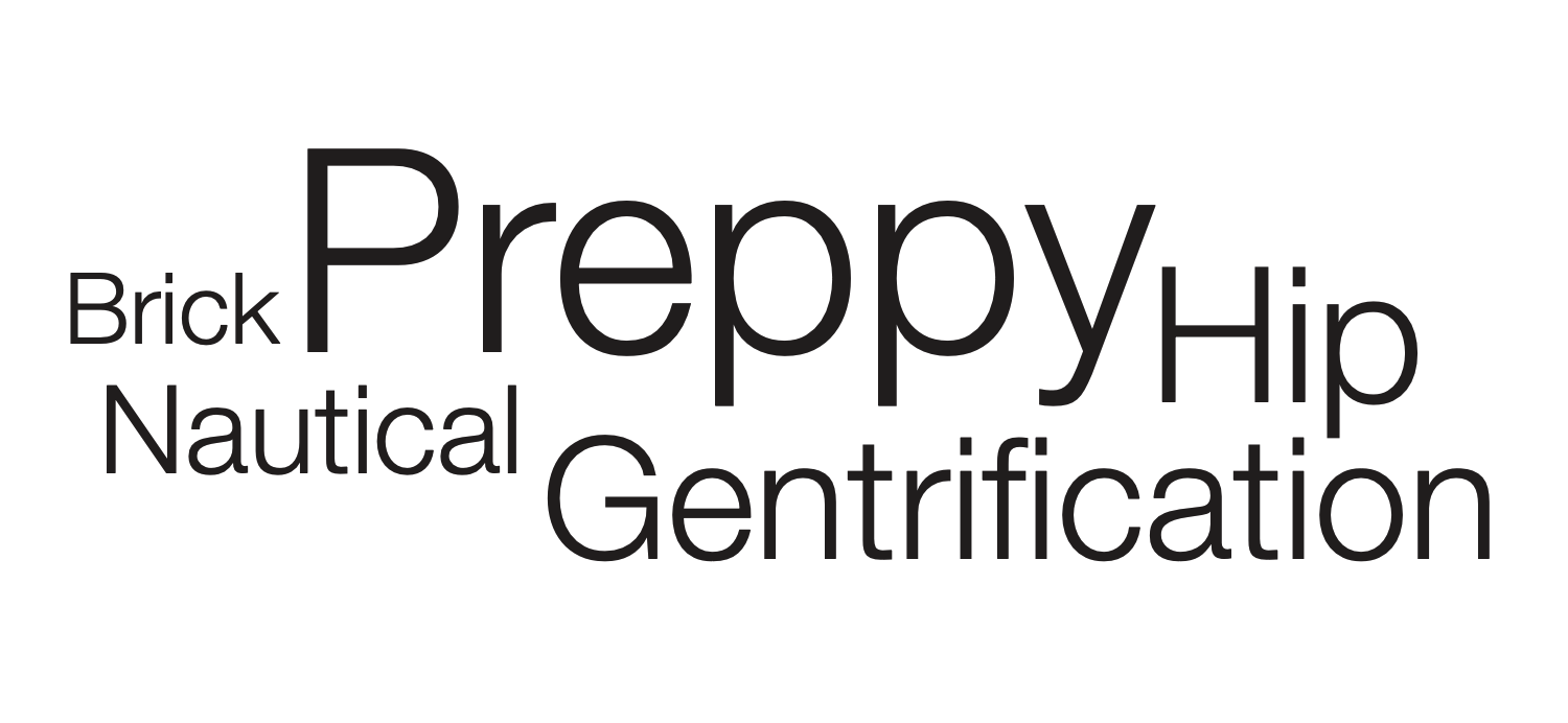
Word List to Describe Portland
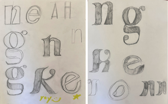
Sketching
When starting my letters, I had the goal of capturing Portlands old-time feel but put a modern twist on it. From my reasarch I have found that Portland is a town rich in history, but has a lot of young people in it. I wanted my letters to reflect an old city with younger generations running it.
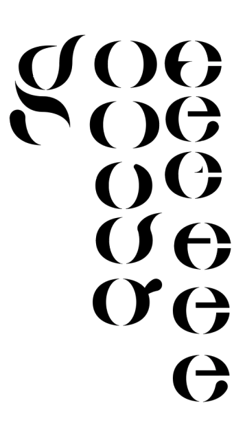
Digitilization
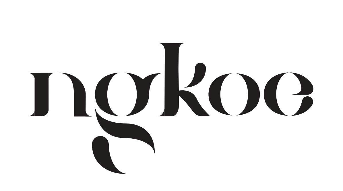
When I started to go digital, I was a fan of the fluid, disjointed strokes and shapes. This symbolizes traditional typography, with a modern twist on it. During my progress, some letters came easier than others. After I solidified the ‘k’ and ‘g’, the rest of the letters fell into place.
Final